ns2_narrows
doeseph Join Date: 2009-11-22 Member: 69467Members, NS2 Playtester, Subnautica Playtester
 Join Date: 2009-11-22 Member: 69467Members, NS2 Playtester, Subnautica Playtester
I've been wanting to make a NS2 map for quite some time now; but I didn't want to just jump in with no plan and end up with an unfinished level after a week or two. So, I went to the drawing board to see what I could come up with - if anything at all - and after a week of brainstorming I finally have myself an idea that I want to move forward with. I'm really excited about this, it's going to be a challenging project that will hopefully end with a fun and balanced map for the community. And I say project here intentionally because there are quite a few things I want to do with this level that one might call "extracurricular". Sorry, I'm not trying to be secretive, a ton of details still need to be sorted out before they're even worth mentioning!
But anyway, on to the stuff I can talk about.
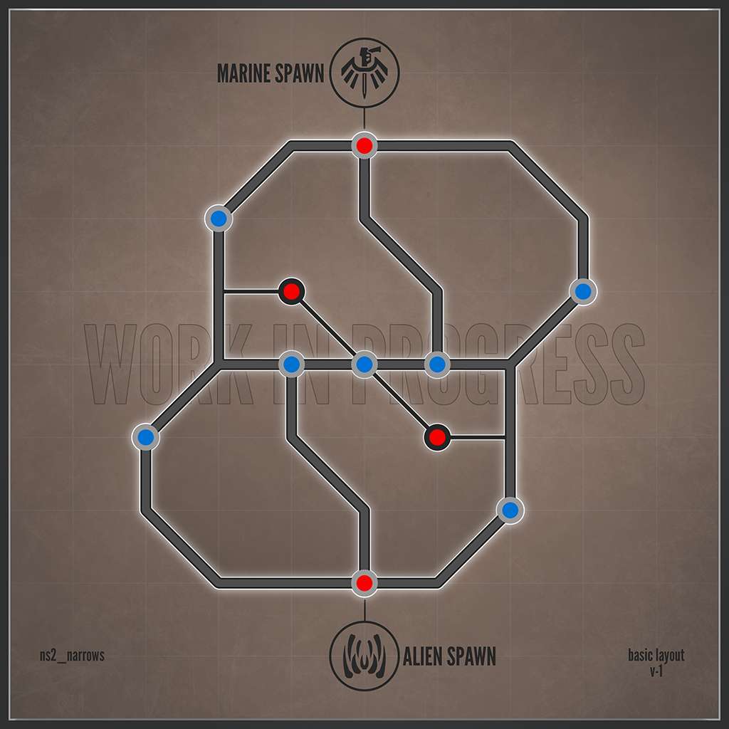
First, the layout itself:

This is the most basic layout of what I have in mind, and it will probably change (again). Currently there are 11 RT's and 4 TP's, which is exactly two more RT's than I want given that there are really only two other Tech Points beside the Marine and Alien spawn. I'm not necessarily dead set on having only 4 TP's, but at this current moment ns2_narrows is being planned as a medium sized map. This may change in the future.
Here are some general details about ns2_narrows:
Note: this entire map and all the ideas I've come up with so far will only happen if they make the map more fun. Anything that doesn't work gets the axe, especially with regards to the design. A solid foundation (read balanced/fun) is first and foremost, everything else is secondary.
Finally here is the road-map, it will help me stay focused moving forward.
Thanks for reading! I'll be sure to update this thread as much as I can.
But anyway, on to the stuff I can talk about.
First, the layout itself:

This is the most basic layout of what I have in mind, and it will probably change (again). Currently there are 11 RT's and 4 TP's, which is exactly two more RT's than I want given that there are really only two other Tech Points beside the Marine and Alien spawn. I'm not necessarily dead set on having only 4 TP's, but at this current moment ns2_narrows is being planned as a medium sized map. This may change in the future.
Here are some general details about ns2_narrows:
- I want navigation to be intuitive, but not simple. The environment cues needs to be as effective as the mini-map (more on that later).
- The outskirts of the map are long and spaced out but gets short and claustrophobic as you move toward the center. Hoping this results in lane control type style or flow.
- Exits/entrances to be clearly visible. Visual noise kept to a minimum.
- Brighter map, slightly more colorful (no orange...)
- Elevation to be a theme (more on that later)
Note: this entire map and all the ideas I've come up with so far will only happen if they make the map more fun. Anything that doesn't work gets the axe, especially with regards to the design. A solid foundation (read balanced/fun) is first and foremost, everything else is secondary.
Finally here is the road-map, it will help me stay focused moving forward.
- Design: Nail down the layout of ns2_narrows
- Testing: Start grey-boxing and playtesting
- Finalize: Design and layout.
- Style: Concept ns2_narrows visual style, colors, lighting, and art
- Create: Custom materials and props based on concept
- Finalize: Publish map!
Thanks for reading! I'll be sure to update this thread as much as I can.
Comments
I'd suggest removing the very center RT to bring down the count to ten. Other than that everything sounds great!
(like Kodiak atm with shorter falls, marines get observation and win)
I'd say have an hourglass shape with vents for aliens but like you said its really early :P I like the image ascetic, howd you make that??
Like Howser (an actual mapper no less!) said, it looks cool.
Fancy designed layouts enable you to plan, but often confuse the mapper with connections. To assist you I have drawn what I call the basic connection map. I have done this for many mappers in the past, and it shows the basic fundamental connections of your map. It shows which points connect to which, so you can easily see the flow of the map, without confusing yourself with junctions and off-centre designs.
At the most fundamental level, this is the connection design of your map:
As you can see, both of your central tech points connect directly to 4 RTs, while both your outer Tech Points connect directly to 3 RT's. To clarify, by direct connection, I mean the route from TP-RT does not contact another RT/TP inbetween. As an example, here is the Summit layout design...
You can see why Atrium is so hard to attack, and why Crossroads is so easy. You can see how few connections there are to each TP/RT though.
I used the summit example as it is also a medium sized map. This is showing the connections at the most basic level, disregarding runtimes etc. The main problem is that you have 4 TP's and 11RT's, so it is almost impossible to avoid giving too many easy connections to RT's.
For a 4TP map, I would recommend 8-9RT's, 10-11 RT's are best left to 5TP maps.
Whatever you decide to do, good luck with the map
@dragonmith At the moment the layout doesn't really show much, just general RT/TP placement and major lane connections. I always planned on adding connecting hallways to open up the ability for switching between the major lanes. I also haven't put much thought towards vent placement, to be honest. I figure I'll work more on that once I get closer to grey-boxing.
As for how I made the image, it was pretty simple to make in photoshop. I just converted the Frontiersman logo to a solid (ridding it of all the detail) and made it brush preset to use like a stamp. I did the same for the Khaara logo, which is nothing but the in-game icon for Skulk Bite. The rest is just layers of pretty stuff, I guess. I can show you if you want, but it really isn't all that fancy!
@Soul_Rider This is very eye-opening, thank you for taking the time to do this. As a result I've gone back and thought through what I'd like my map to be based on your idea of design links and flow, and I ended with three that I feel are a good base to start with. Let me know what you think guys think:
I have to admit that a lot of what I'm doing leaves much to be desired, and I can't shake the feeling that you can get away with more in an NS2 map than previous designs and guides would have you believe. I'm not necessarily trying to fix what isn't broke either, but I do want to see how creative I can get before I have to go back and start all over again.
Will update when I have more, thank you for taking the time to read and respond guys.
@deathshorud, these layout diagrams do not mean the map is going to be symmetrical, it just explains the connections between nodes etc.
All of them would probably have a lot of action in the middle, which could be interesting. If you chose the middle one, make sure to not put those TPs too close together in the center, or it will become impossible to capture them once you lose both (making it a 2 TP room-array).
These are not ring maps, these are just basic connection diagrams to see what TP's and RT's connect to each other.
I can make a ring map for any of the official maps to show the connections... except tram, as because of tram tunnels you can get from any point on the map, to any other point on the map, without going through another TP/RT. The only exception is server room, that is not connected directly the the tram tunnel..
@doeseph - Still make your normal layout designs, but check them with the connection diagrams, it is actually quite hard to use a connection diagram and then come up with the layout.
In the meantime, here is a floor plan of ns2_narrows which shows each location. Note that the scale is NOT accurate and room sizes/distances will fluctuate. I'm aiming to add one more TP to make a total of 5, but as it stands there are only 4.
Thanks for readin'
Anyways, it looks like there are a ton of connections here... almost too many. That was one of the many big problems I had with my original hotdogs map: too many way to get everywhere.
Also, I'm not sure how well it will work to have two TP's with a short, direct path to one another, especially considering there are only 4 on this map. (PG in between = win?)
Still, I have to say: wow! That's a lot of work you've put into the layout diagram... almost too much work to be honest. Not that it doesn't look nice, it really does, but I recommend you actually build a rough layout in spark first, to get a feel for the route timings, and then worry about what the rooms will look like. One of the most important parts of your layout is the amount of time it takes to get from TP to RT. Most maps have this timed to be between 13-16 seconds WALKING as a marine (w/ all equipment, etc. etc.). My new version of hotdogs suffered from this because each RT took about 22 seconds to get to. I made the mistake of thinking that it didn't matter as long as all the routes had the same timing regardless of length... which was devastating for marines because a skulk can chew down an extractor in 23 seconds, not to mention if two hop on it.
So what I recommend you do is build a sort of "skeleton" layout of the map in spark (doesn't even need walls, just floor!), walk it out, make tweaks to it here and there to ensure the routes are the same length, then start building your greybox rooms based on this. I wish I had figured this out a long time ago, because I'm paying for it now with lots of layout changes to a map that I thought was balanced, but oh well, glad to help someone else from falling in this pit as well.
Also, the floor plan above does show some of the more major details (in many cases it only shows playable area), but its main purpose was helping me think through the style of each location. The scale is NOT accurate and room sizes/distances will fluctuate.
Ignore the map orientation, it's already been rotated.