(Mini)map improvements
Bicsum Join Date: 2012-02-27 Member: 147596Members, Reinforced - Gold
 Join Date: 2012-02-27 Member: 147596Members, Reinforced - Gold
Hi,
in order to give the players a better understanding of where to be and what to do, I'd like to suggest two improvements for the map (C key):
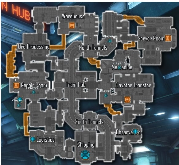
Currently it looks somewhat like this:

1) Team presence indicator
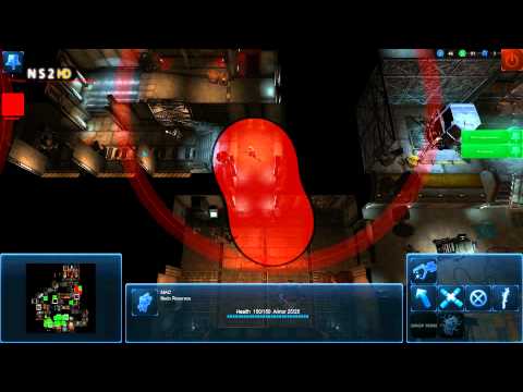
Back in the alpha the marine commander would see circles around the marines, which were supposed to work like a squad system:
I think that, if applied to the map, it would emphasise positioning better.
Like so:

You could see the presence of your team better and fill the gaps accordingly. In that example screenshot, it would be easier to see that the way to your base is open through hub.
The size of that circle mght scale with the players mobility, so that a jetpacker has a larger circle than a non-jetpack flamethrower marine.
2) Player and structure health
Additionally, I'd like to see a health indication for structures and players on the map, so you'd know where to weld or where to heal as a gorge. A red/yellow/green dot in the centre of the icon could suffice (at least for structures).
Like so (player health not included):

Player health could be shown like the bars for the marine commander.
The benefit would be better team play, because as alien you'd know who should engage first depending on hp and welding as a marine and healing as gorge would be easier and faster.
edit: of course the health indication dots need to be visually different than the observatory scan dots.
in order to give the players a better understanding of where to be and what to do, I'd like to suggest two improvements for the map (C key):
Currently it looks somewhat like this:

1) Team presence indicator
Back in the alpha the marine commander would see circles around the marines, which were supposed to work like a squad system:
I think that, if applied to the map, it would emphasise positioning better.
Like so:

You could see the presence of your team better and fill the gaps accordingly. In that example screenshot, it would be easier to see that the way to your base is open through hub.
The size of that circle mght scale with the players mobility, so that a jetpacker has a larger circle than a non-jetpack flamethrower marine.
2) Player and structure health
Additionally, I'd like to see a health indication for structures and players on the map, so you'd know where to weld or where to heal as a gorge. A red/yellow/green dot in the centre of the icon could suffice (at least for structures).
Like so (player health not included):

Player health could be shown like the bars for the marine commander.
The benefit would be better team play, because as alien you'd know who should engage first depending on hp and welding as a marine and healing as gorge would be easier and faster.
edit: of course the health indication dots need to be visually different than the observatory scan dots.

Comments
This is rookie friendliness, not HP bars ;]
I think even the best players sometimes forget where to go and what to do. The player icons on the map are sometimes hard to see, because they merge with structure icons. For example when someone builds an RT. When under stress, you might lose track of where every marine is. With this, you would know right away how your team is positioned.
The overlapping parts of the circle should be less transparant, which would indicate more power.
I would even go so far and make these circles for enemy players as well. So that you see these enemy presence circles for parasited marines, or generally marines that are in in line of sight. You could then educate the aliens to avoid these circles and to parasite more often to get these circles.
The yellow line means having line of sight (even when not looking in that direction). The red line means breaking line of sight. You could make it so that it blinks and then fades out after 1-2 seconds.
but please keep in mind that all these possible changes need to be configurable or at least toggable to shut it off, if its to shiny on a transparent map
Mapmode toggles.
All these ideas are well and good, but what if someone doesn't want them? (I.E they get a bit cluttery in say.. a 24v24 server?
There is a minimap but when you press C it shows more details about the lifeforms than the red dots on the minimap.
Please Replace the red dots on the minimap with lifeform indicators OR and this will be a risky move and rather not see it change the lifeform indicator on the big map into red dots.
This is cool. Great mockup.
But if aliens had a minimap that was more like this (from OP):
Then maybe an alien minimap can be made that shows red orbs where enemies are, or red sectors that have enemy presence. This way, the marines keep their asymmetrical minimap advantage, but aliens still have a general idea of what's going on in the map without having to bring up the full map, which has more specific information.
Good ideas in this thread tho
Couldn't you just mix something with mcglaspies atmospherics mod and how infestation is shown?
For Example on Tram you need two marines to lane block Hub (Mezzanine <> Elevator and North Ttunnels <> South Tunnels). If it was room centered and Hub was colorized, because it had one marine standing on the Elevator lane, South Tunnels would still be open and the map wouldn't properly show this.
As amazing as Trixx's mockup looks, this would also mean a lot of work to change all the maps' location entities. Might even need to add locations to certain corridors that are covered by a room's location entitiy right now, or a new type of location entity for the minimap highlights only.
Not sure why that would have to happen, existing location entities should work fine.
I'm thinking... why not do both? Have the rooms on the minimap show a very subtle blue tint to show it's marine territory, with much more visible circles around the marines themselves to show where they are at that moment.
Are you working on something like that...? This is ages ago, but haven't seen something like this in trello... this wouldn't only help veterans, but rookies to tell them... look noone is covering hub.. skulks slip through... the visual indicator would help that they'd more intuitively lane and cover RTs... even if they only glance for a second on a map. (And especially lower skilled players only glance at the map..)
In General Laning / Covering the map has always been a big problem for all non-high-skilllevels...